Space, Serenity, and the Power of Negative Space: The Making of Winter in White
When I sit down to create a new piece of modern abstract art,
I am always thinking about the relationship
between absolute stillness and active movement.
In my studio, I am often called the Queen of Texture.
It is a title I wear with immense pride
because it reflects a lifelong obsession
with the physical, three-dimensional reality of paint.
However, over the years of working and reworking canvases,
I have learned a vital truth:
True texture needs a counterpart to shine.
It needs a playground. It needs space.
For me, every single canvas is a classroom.
I deeply love to learn something entirely new
every time I am creating a work.
But to learn, I first have to listen.
I need to receive a message from the piece as it develops,
and that can only happen when the frantic noise
from the outside world is completely turned off.
I have to consciously silence the daily distractions,
let go of the external chaos, and go deep within myself.
Only in that inner quiet can the artwork begin to speak to me.
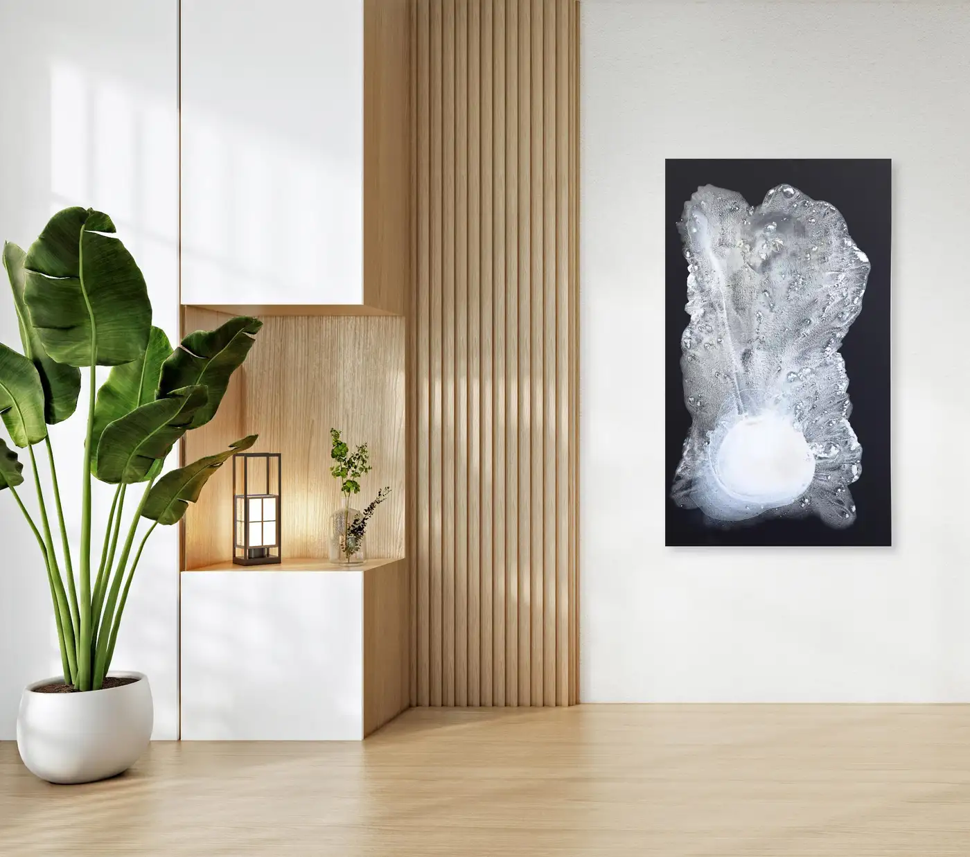
In my piece, Winter in White, 60×25 inches,
my ultimate goal was to explore that exact balance—
the intersection where heavy, visceral material
meets the quiet, expansive freedom of negative space.
Consequently, when placed in a modern interior,
This piece acts as a visual anchor,
transforming a room into a Zen sanctuary
where a cluttered mind can finally settle down.
The Foundation of Stillness: Airbrushing Payne’s Gray
The journey of Winter in White began not with a heavy palette knife or thick paste, but with a breath of air.
To create an environment where intense, heavy textures can live without overwhelming the viewer, you must first build a sanctuary on the canvas.
Therefore, I chose Payne’s gray as my foundation. It is a color of incredible emotional weight— not quite black, not quite blue, but a deep, atmospheric hue that feels like the sky just before a heavy snowfall.
Using an airbrush allowed me to lay this color down as a smooth, seamless, uninterrupted mist. Because of this technique, there are no brushstrokes here, no evidence of the human hand, and no ridges to catch the light.
It mimics the deep, quiet void of a winter dawn— a vast expanse of negative space that serves as a visual deep breath.
Interestingly, this vast expanse of negative space also carries the memory of the ocean. I remember watching a massive high tide roll in. Naturally, I stayed safely on the side— I didn’t want to get too wet! The crashing water wasn’t dark at all. Instead, it was blindingly white, incredibly powerful, and bursting with magnificent high energy. I absolutely loved the chaotic rush of the white bubbles as they collided with the shore. Capturing that fierce, bright, high-energy white foam against a deep background became the exact inspiration for the movement exploding out of the smooth Payne’s gray.
This negative space is entirely intentional. By giving the canvas large areas of smooth, velvety dark tones, I am creating a vacuum of stillness.
In a world full of visual noise, digital screens, and constant stimulation, negative space on a canvas functions as a reset button for the central nervous system.
Ultimately, it allows the eyes of the viewer to rest, to expand, and to find peace before they ever begin to decipher the details of the foreground.
The Language of Texture: Creating History and Depth
Once the stillness of the background was locked in, the real physical labor began.
This is where I step fully into my role as the Queen of Texture, using palette knives, trowels, and heavy mixed-media texture pastes to sculpt layers of pure white over the Payne’s gray.
Texture in modern abstract art is not merely a decorative choice; it is a language.
Texture creates history. Every layer of paint that is applied, scraped back, built up again, and manipulated carries the physical imprint of a specific moment in time.
When a viewer looks at a flat painting, they see a finished image. But when they look at a heavily textured painting, they are looking at archaeology.
They can see the geological history of the artwork’s creation— which layer came first, where the palette knife pressed hard into the canvas, and where the paint resisted the tool.
In Winter in White, the thick, organic forms ripple and burst forth from a concentrated, glowing orb near the bottom of the canvas, moving upward in a dramatic, frozen cascade.
It mimics the natural, unpredictable formations of ice, the churning energy of water, or the sudden, fragmented emergence of old memories bubbling up from the subconscious.
By heavily building up the white paint, I am creating a literal, physical depth. The artwork ceases to be a two-dimensional plane and becomes a low-relief sculpture.
This depth forces the viewer to interact with the painting from different angles. It cannot be fully understood from a single vantage point; you must walk past it, view it from the side, and watch how the shadows fall into the valleys of the white peaks.
The Alchemy of White and Payne’s Gray
People often ask me why I am so deeply drawn to white. To many, white represents an absence—a blank slate, an empty canvas, or a cold void. But to me, white is the most complex, emotional color on the spectrum.
White is not empty. It is heavy with history, light, and hidden possibilities.
In my work, white represents a clean slate, rebirth, and the ultimate form of purity. It holds a quiet power that doesn’t need to shout to be noticed. When I lay down thick, heavy strokes of white, I am not painting nothingness; I am painting presence. I am sculpting light itself.
But white cannot tell its story alone. It needs a shadow to give it a voice.
That is why the partnership between white and Payne’s gray is so sacred in my studio. Payne’s gray is not a flat black; it carries hints of ocean blue and stormy twilight. When pure white collides with the velvety depths of Payne’s gray, magic happens.
The dark underlayer pushes the white forward, making the textures lift off the canvas. The gray gives the white a baseline of gravity, mystery, and history. Together, they mimic the ultimate law of nature: light cannot exist without darkness, and healing cannot happen without the shadow.
To make this creation even more exciting and vibrant, the white I use is infused with a subtle pearl finish.
This pearl element gives the white an iridescent quality. It isn’t flat or static; instead, it shimmers with an internal glow.
The pearl particles catch the light like sun glinting off ocean foam, adding a layer of sophisticated brilliance that makes the entire canvas feel alive.
The Chemistry of Materials and the Meditative Grind
Achieving this level of texture without compromising the integrity of the canvas requires an intimate understanding of mixed media.
You cannot simply pile on standard acrylic paint to this thickness; it would take months to dry and eventually crack, lose its volume, or peel away.
To achieve the rugged, structural ridges in Winter in White, I blend high-density modeling pastes with specialized acrylic mediums.
This creates a compound that is incredibly malleable while wet, allowing me to carve, stipple, and loop the material, yet it cures into a rock-hard, durable archival structure.
The process of building these layers is deeply meditative, almost primal. It requires a lot of upper-body strength to drag a loaded trowel across a 60-inch canvas, pushing against the resistance of the heavy paste.
There is a beautiful friction in this work. As I work and re-work the canvas, layering textures to give added dimension, I am engaging in a silent dialogue with the material.
I am pushing the paint forward into new directions, letting the odd ends of my attempts speak for themselves.

The Dynamic Interaction of Light and Living Spaces
One of the most magical qualities of heavily textured, minimal art is that it is never truly finished. The final collaborator on Winter in White is the light inside your home.
Because the background is an airbrushed, light-absorbing matte Payne’s gray and the foreground consists of pure white, reflective sculptural ridges, the piece interacts dynamically with ambient light.
As the sun rises and sets throughout the day, the natural light hits the canvas at shifting angles:
In the bright morning light, the white textures pop with crisp, sharp contrast, looking energetic and fresh.
In the soft afternoon glow, the long shadows cast by the paint’s thick ridges stretch across the Payne’s gray negative space, revealing hidden sub-layers and soft gray nuances within the white itself.
In the warm evening lamplight, the painting softens, turning into a glowing, mysterious landscape of shadow and relief.
This changing nature makes the artwork feel alive. It evolves alongside the rhythm of your day, ensuring that every time you look at the wall, you discover a subtle new detail, a hidden valley, or a shadow you hadn’t noticed before.
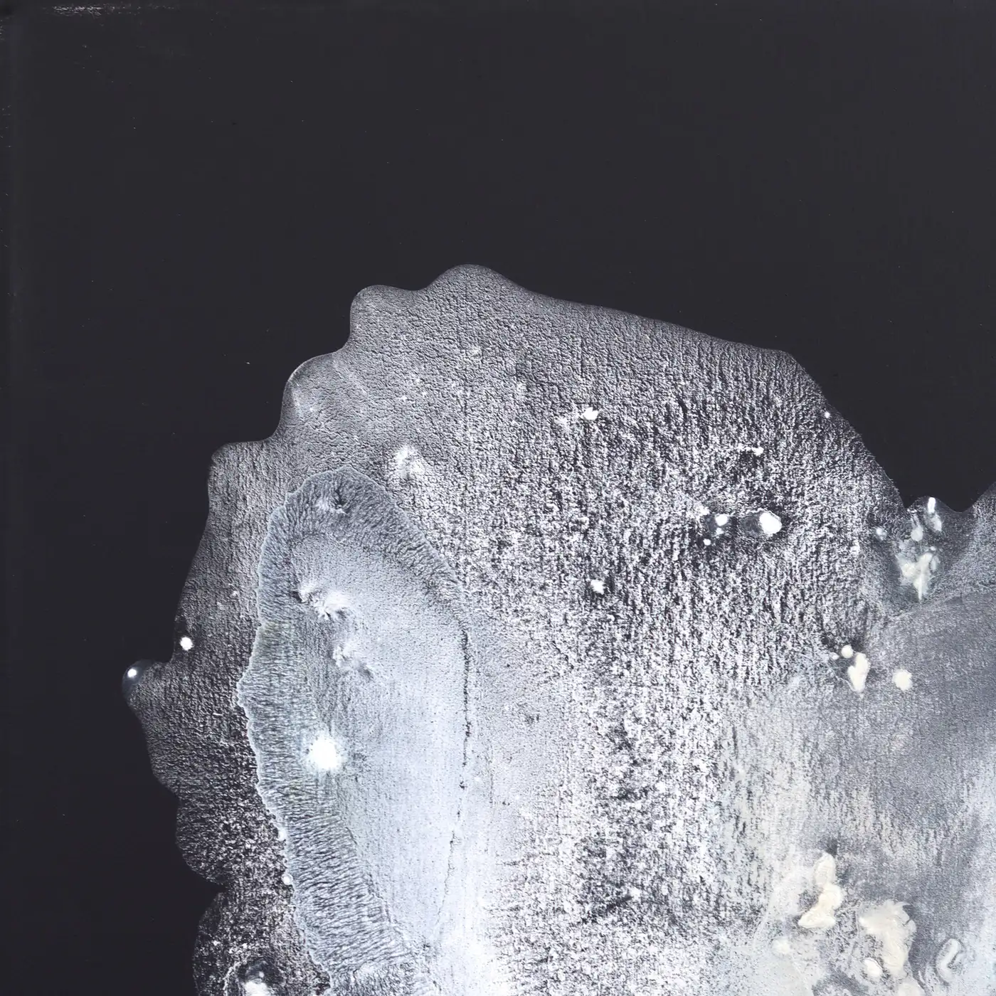
🔍 Under the Magnifying Glass: A Texture Close-Up
As the Queen of Texture, I believe that art should invite you to cross the room and look closer. It shouldn’t just look good from a distance; it should reward intimacy.
Below is an ultra-close, macro look at a single section of Winter in White.
Notice the complex topography of the surface— the micro-bubbles trapped in the drying medium, the sharp, crystalline edges left by the quick snap of a palette knife, and the sheer verticality of the white paint as it rises out of the dark, airbrushed void.
This is where the true history of the painting lives.
By balancing this intense, historic depth with the calm, soothing expanse of negative space, Winter in White achieves its ultimate purpose: transforming your living space into a calm, centered sanctuary.
How does texture speak to you in your own living space? Explore more original modern abstract art and textured collections directly in the Clara Berta Studio.